
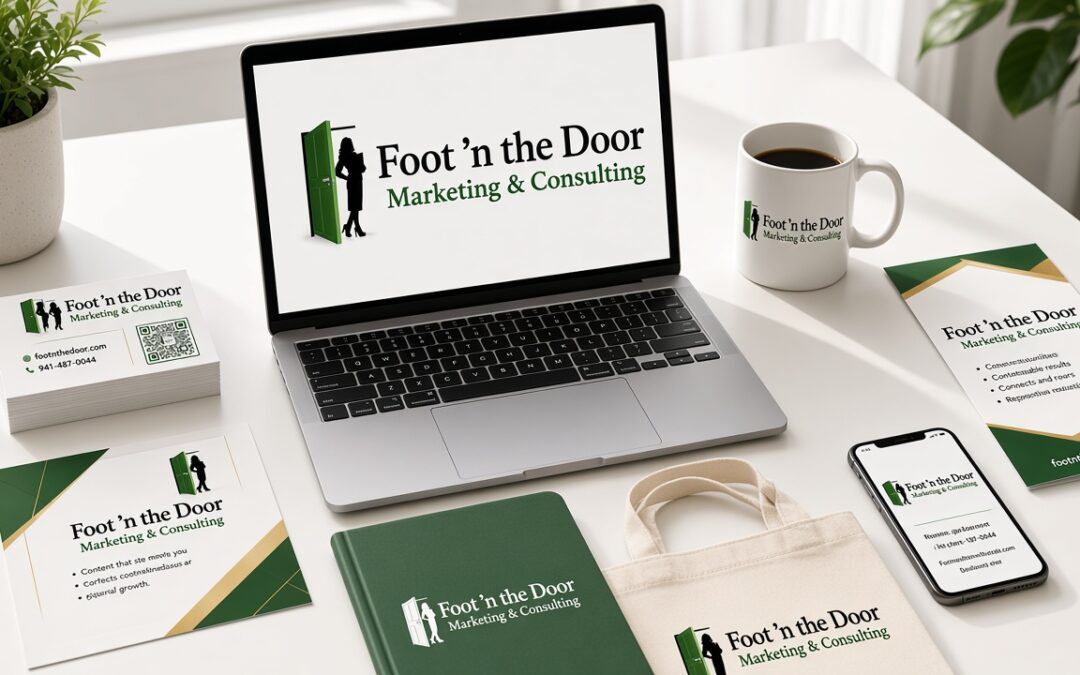
You got a logo designed. You put it on your business cards, maybe on your truck or your website. And it can still feel like people do not really know your business.
A logo is a good start. It is not the whole brand.
Branding is the look, sound, and feeling people associate with your business. Your logo is one part of that. So are your colors, the way you write and speak, and the images you use. When those pieces work together, people can recognize you. When they do not, you can spend money on advertising and still be hard to remember.
In an earlier post, I wrote about why advertising gets ignored: being seen is not the same as being remembered. Branding is what helps people remember that it was you.
Would someone recognize you without the name?
Here is a simple question to start with. Would someone recognize your business without seeing its name?
If you covered the words on your truck, your business card, or your website, would the colors, the photos, and the overall feeling still say it is you? Or could those materials belong to almost anyone?
If the answer is fuzzy, you do not necessarily need a new logo. You may need a more consistent brand.
Branding is four things working together
A brand comes down to four parts that have to work together.
Your logo should be recognizable. It does not have to be fancy. It does have to be clear enough, and used often enough, that people can start to know it is yours.
Your colors should be consistent. If your card is one color, your website is another, and this month’s flyer is something else again, people have to relearn who you are every time they see you. Pick a small set of colors and stay with them on your ads, your site, your truck, and your paperwork.
Your voice should sound like you. Voice is the tone of your writing and the way you talk to customers. Are you warm and plain-spoken? Direct and practical? If your website sounds formal and your emails sound like a different person, that is a branding problem too. People should feel they are hearing the same business, no matter where they find you.
Your images should feel authentic. Photos of your real work, and the kind of results your customers want, will always do more for you than generic pictures that could belong to any company. The feeling in the photo matters. People remember how a business made them feel.
None of these four stands alone. A strong logo with inconsistent colors, a stiff voice, and stock photos is only halfway to a brand.
Consistency is what people remember
The point of all this is not to make everything look pretty. The point is to become familiar.
When someone needs what you do, you want your business to come to mind. That is top-of-mind awareness, and consistency is what builds it. The same look. The same voice. The same feeling, over and over, until people do not have to work to remember you.
That is also how branding supports sales and revenue. People are more likely to call, visit, or buy from a business they already recognize and trust. A scattered look makes you harder to trust, not because your work is weaker, but because the customer cannot get a clear picture of who you are.
You do not have to be the loudest business on the street. You have to be the one they can recognize when the need comes up.
AI can help. It should not replace you.
AI can be useful for ideas and first drafts. I am not against using it.
What I caution people about is handing the whole look and voice of the business over to a tool. If you let it write all of your copy and generate all of your images, you can end up with something that looks and sounds like everyone else. That erases the very thing branding is supposed to protect: what makes your business different.
Use the help. Then put your own creative side back into the work. Change the words until they sound like you. Choose photos that feel real. Keep the details only you would include. A brand that could belong to any business will not help the right people choose yours.
Try this with your brand this week
You do not need a full rebrand to start. Pull a few pieces of marketing you already use — a business card, a flyer or print ad, your website, maybe the sign on your truck — and look at them side by side.
- Would someone recognize this business if you covered the name?
- Do the colors match from one piece to the next?
- Does the writing sound like the same person?
- Do the photos feel like your real business, or like they could belong to anyone?
- If you used AI anywhere, did you keep what makes you different, or did the result feel generic?
If a few of those answers are shaky, pick one place to tighten first. Match the colors. Rewrite a few lines so they sound like you. Swap a generic photo for a real one. Small, consistent changes are how a brand starts to feel like a brand.
A good advertisement can make people remember your name. A great one makes them remember your name and why they should choose you. Branding is what makes that possible, because people cannot choose a business they cannot recognize.
If you would like a second set of eyes on how your business shows up, I am happy to look at it with you. You can request a free website audit at footnthedoor.com/services/. The audit is a review of your site. It does not include making the changes for you. You can also reach me at missy@footnthedoor.com or 941-487-0044.
Small Steps. Big Changes.